To celebrate our first 50 years of business, we have put together a brand-new visual identity and concept. This will be a major asset and will change the way the world and the market see us.
SINCE 1971, SOLUTIONS THAT MATTER
As we celebrate this landmark anniversary of our company’s first 50 years in business, we remain aware of the importance of striking a balance between the legacy of the past and a drive towards the future. Certain things remain the same, such as our commitment to sustainability, pioneering spirit, and people-centric approach, while others have changed in response to a constantly shifting world.
This is why we made the decision to work on our Visual identity to describe this balancing act between history and innovation, with a reassuring blue and a passionate red.
There are 5 parts to this new and improved identity:
1. a restyled version of the wave design, which is a familiar fixture of the ICA Group logo;
2. a newly-created system of decorative elements based on a reworking of the three letters that make up the word ICA;
3. the use of a color gradient effect shifting between red and blue;
4. a special version of the logo to celebrate our first 50 years;
5. a new concept that encapsulates all the value that we bring to our partners: SOLUTIONS THAT MATTER
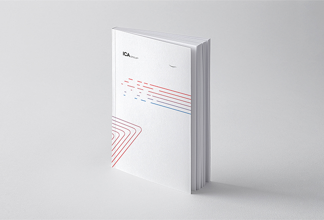
A FAMILIAR LOGO. A NEW WAVE
We know just how important it is to get each detail right. This is why we have reshaped the iconic wave on the ICA Group logo, changing its thickness and traits. The changes we have made will make it more suitable for digital platforms and new communication channels.
SIGNAGE THAT ELEVATES OUR COMMUNICATION
All names are loaded with a potential for expressiveness. With our Visual Identity, we wanted to unleash the expressive force contained in the three letters of our name: the I, the C and the A.
These three letters take on a decorative guise, transitioning from one hue to another in a forward drive into the future.
STILL BLUE AND RED, BUT IN A DYNAMIC FASHION
Our colors continue to be red and blue, which are rendered in a completely new version. The gradient effect allows to convey our dual nature, symbolizing our ability to deliver contemporary, up-to-the-minute and connected responses.
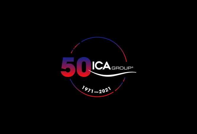
50 YEARS THAT OPEN A CIRCLE
The logo that commemorates 50 years of history is an emphatic statement that 2021 is not the end of a cycle, but rather the start of a new one. We are steering a new course that the entire corporation feels involved in, as we navigate a world of solutions and opportunities.
SOLUTIONS THAT MATTER
As sector pathfinders, we strive tirelessly to innovate products and services, and to deliver the best possible solutions. We want to help our customers both to meet challenges and exploit opportunities to a high level of success. What we do is not limited to a series of products: we propose solutions that yield results, solutions that matter.
WELCOME TO OUR NEW VISUAL IDENTITY
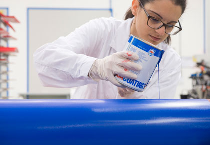 Our products are designed to protect and decorate wood and glass with a common denominator in mind: to combine innovation, high quality and low environmental impact.
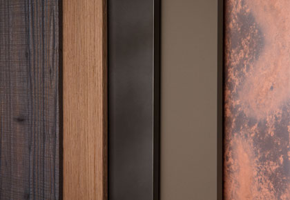 The ICA Group world is constantly evolving, always attentive to design trends and to the requests of designers and architects. Our color and finish trends are a source of inspiration for the Italian and international market every day.
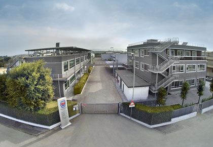 We are a big group with firm and deep roots. Thanks to our know-how, R&D investments, respect for the environment and high quality, we have become world leaders in innovative coatings for wood and glass.